
Shadcn UI
ComponentsBeautifully designed components that you can copy and paste into your apps. Accessible. Customizable. Open Source.

BadtzUI
ComponentsAn open-source React UI library with production-ready animations. Weekly updates. Built with React, Tailwind, TypeScript & JavaScript.

Tailark
ComponentsSpeed up your workflow with responsive, pre-built UI blocks designed for marketing websites.


Animate UI
ComponentsFully animated, open-source component distribution built with React, TypeScript, Tailwind CSS, Motion and Shadcn CLI. Browse a list of components you can install, modify, and use in your projects.
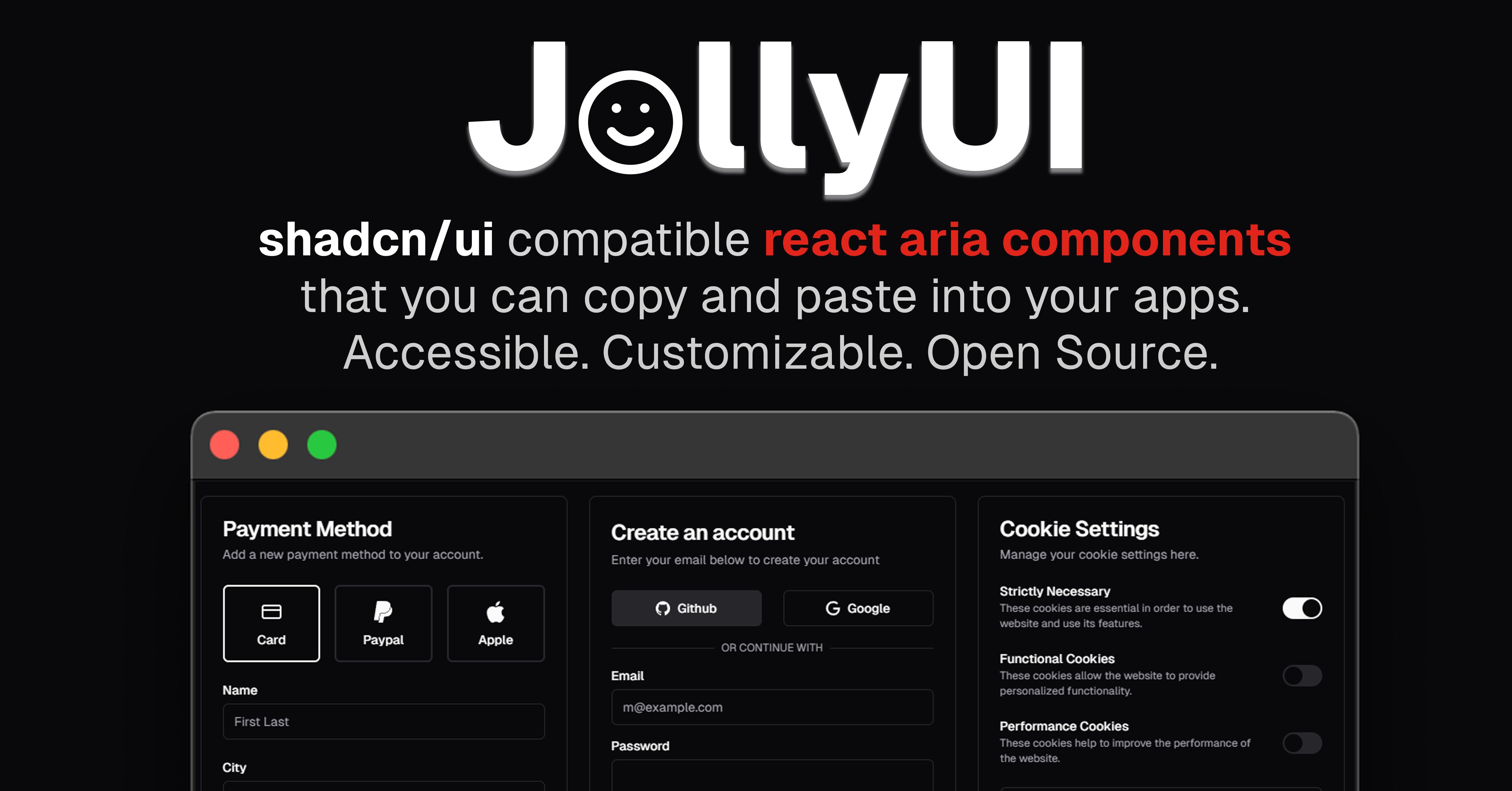
JollyUI
Componentsshadcn/ui compatible react aria components that you can copy and paste into your apps. Accessible. Customizable. Open Source. Formerly known as shadcn-aria.
Componentry
ComponentsBeautiful, animated, copy-paste React UI components built with Tailwind CSS, TypeScript, and Framer Motion. Free and open-source.

SmoothUI
ComponentsExplore smooth animated UI components for React, powered by TailwindCSS and Framer Motion. shadcn/ui compatible components for modern web development.

BlocksSo
ComponentsA set of beautifully-designed, accessible components and a code distribution platform. Works with your favorite frameworks. Open Source. Open Code.
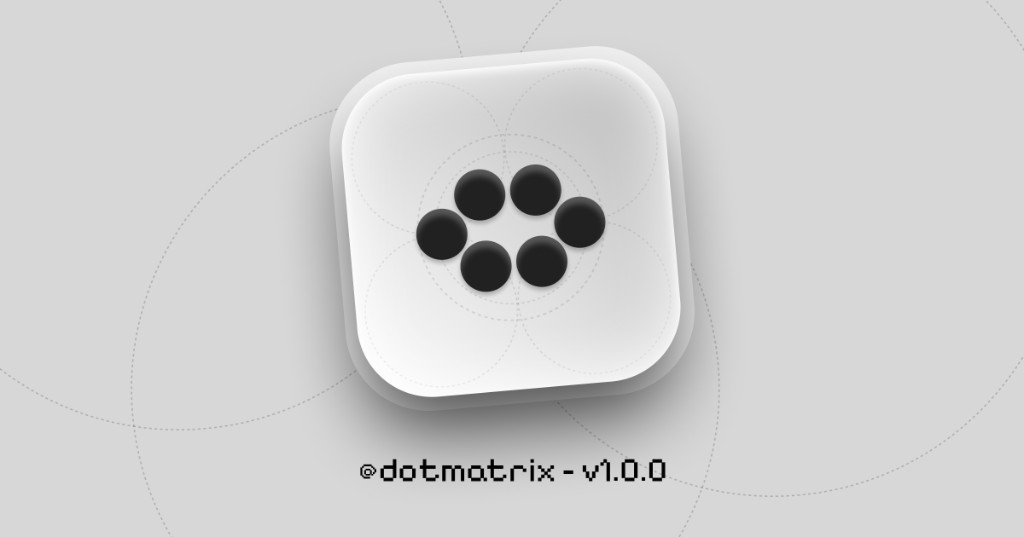
Dot Matrix
ComponentsDot Matrix is a React component library of dot matrix loaders—expressive loading primitives you install via the shadcn registry and own as local code.
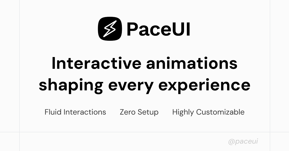
PaceUI
ComponentsAnimated components and building blocks built for smooth interaction and rich detail. Copy, customise, and create without the extra setup.
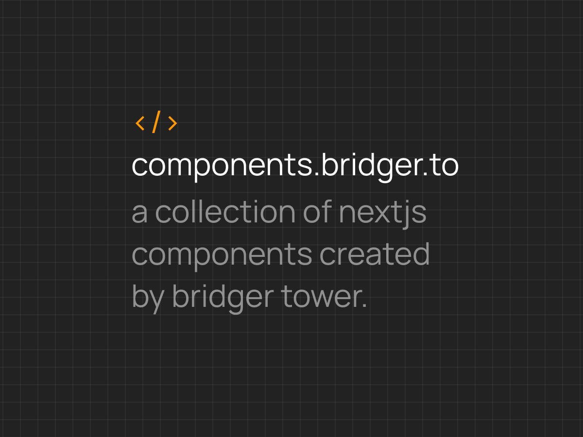
Components.work
ComponentsCollection of Typescript React components for Next JS built using Tailwind and shadcn/ui. Created by Bridger Tower.

ReUI
ComponentsOpen-source collection of UI components and animated effects built with React, Typescript, Tailwind CSS, and Motion. Pairs beautifully with shadcn/ui.

Efferd UI
ComponentsEfferd UI is a collection of beautifully crafted Shadcn UI blocks and components, designed to help developers build modern websites with ease.
Indie UI
ComponentsMake your website stand out with minimal effort. Built with Reactjs, shadcn and Framer Motion for animation.
Ruixen
ComponentsCollection of customizable and open source components made with Next.js, Tailwind, Typescript, and Framer Motion.

Kibo UI
ComponentsKibo UI is a custom registry of composable, accessible and open source components designed for use with shadcn/ui.
SHSF UI
ComponentsEffortless, elegant, and open-source (coming soon). A motion-first UI library built with React, TypeScript, Tailwind CSS, Motion, and shadcn/ui.


Fancy Components
ComponentsReady to use, fancy React components to make the web fun again. Free & Open Source.

Shapex UI
ComponentsBoost your web application's performance with reusable blocks built on shadcn/ui, Framer Motion, designed for efficiency and scalability. You can copy and paste. Open Source.
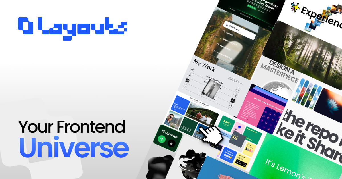
Ui-Layouts
ComponentsBeautifully designed React + Next.js + TailwindCSS components. 60+ ready-to-use, accessible, and customizable UI pieces — open source and free.
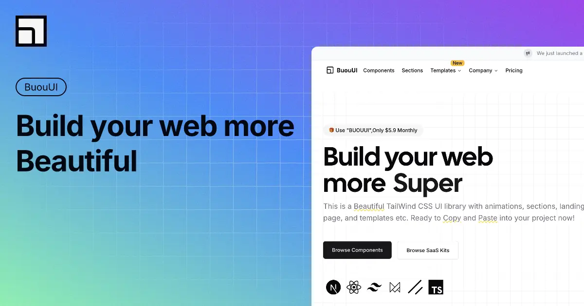
BuouUI
ComponentsThis is a beautiful UI library with components, sections, landing page, and templates using Tailwind CSS.
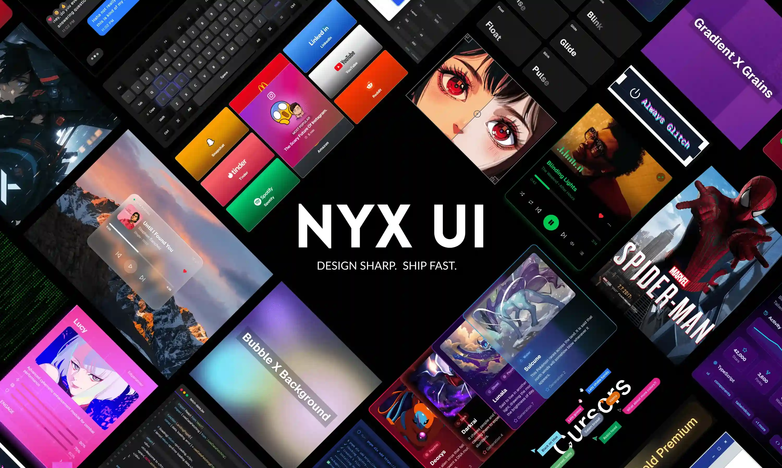
Nyx UI
ComponentsThe most comprehensive React UI library for Next.js. 30+ modern components built with Tailwind CSS and Framer Motion. Start building beautiful interfaces today.

NextUI (HeroUI)
ComponentsBeautiful, fast and modern React UI library that allows you to create beautiful websites regardless of your design experience.

Mvpblocks
ComponentsCopy, paste, customize—and launch your idea faster than ever. Mvpblocks is a fully open-source, developer-first component library.
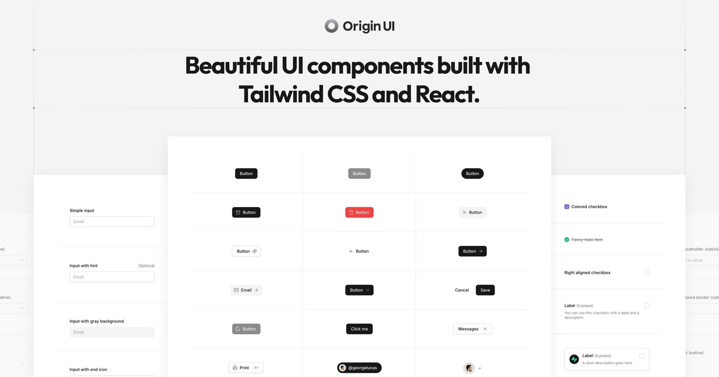
Origin UI
ComponentsBeautiful UI components built on top of shadcn/ui and Tailwind CSS. Copy, paste, and customize.
Unizoy UI
ComponentsCopy-Paste UI elements that save development time. Accessible, customizable, and open-source.

Launch UI
ComponentsCarefully crafted components and templates built with React, Shadcn/ui and Tailwind that will help your product stand out from the crowd.
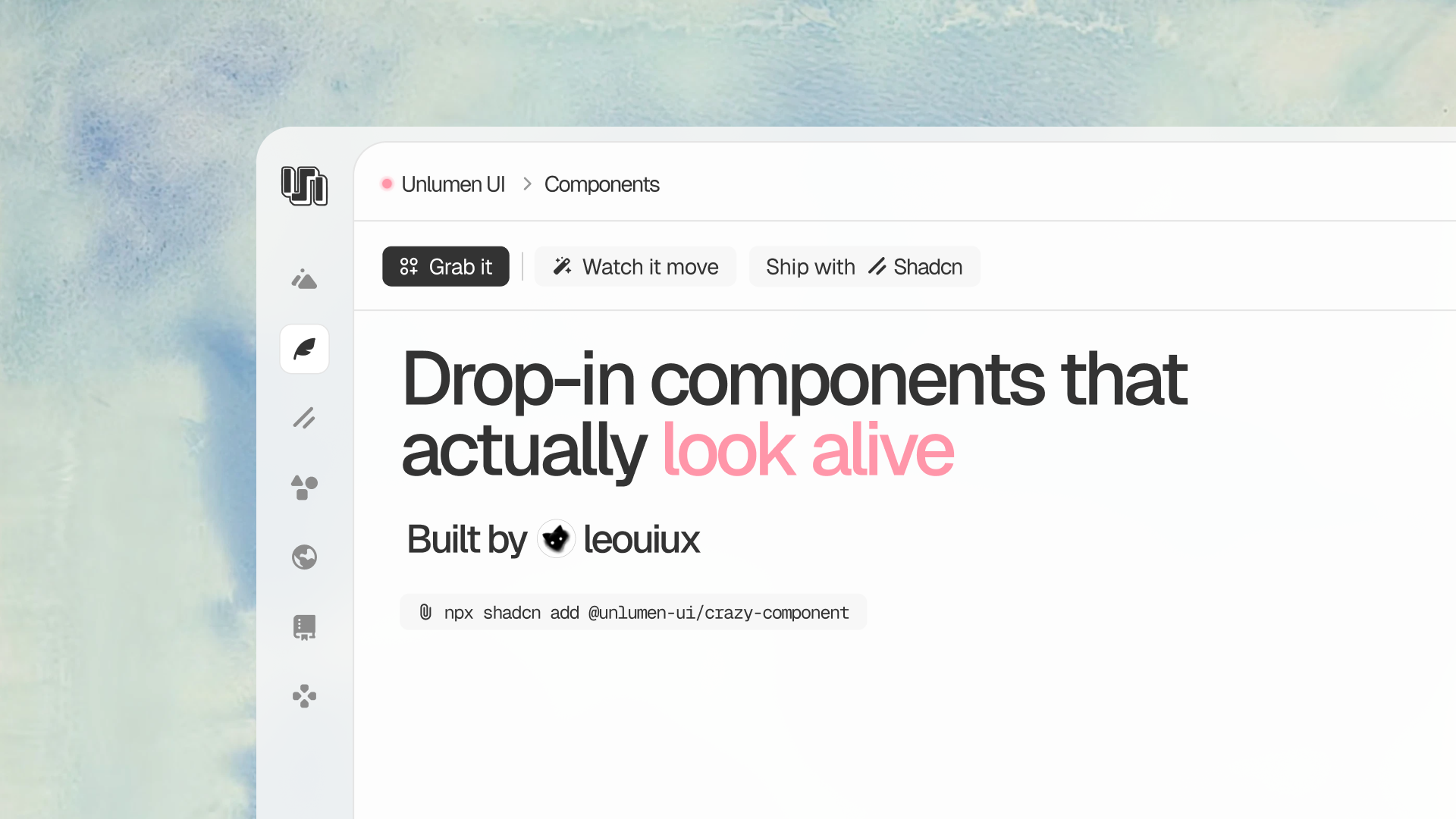
Unlumen UI
ComponentsA curated registry of beautifully designed React components built with TypeScript, Tailwind CSS and Motion. Install with the shadcn CLI and build refined interfaces faster.

KokonutUI
ComponentsCollection of 100+ stunning UI components free and open source built with Next.js, React, Tailwind CSS, and Motion.
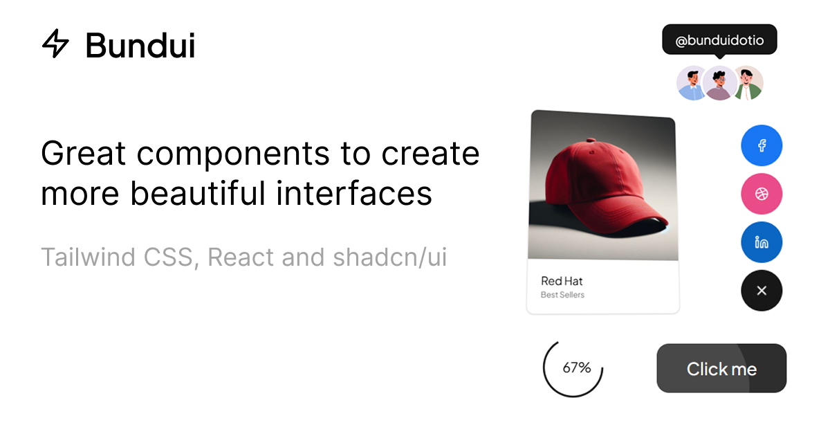
Bundui
ComponentsBeautifully designed Tailwind CSS, React, shadcn/ui and Motion components. Easy copy-paste. Customizable. Open Source. TypeScript compatible.
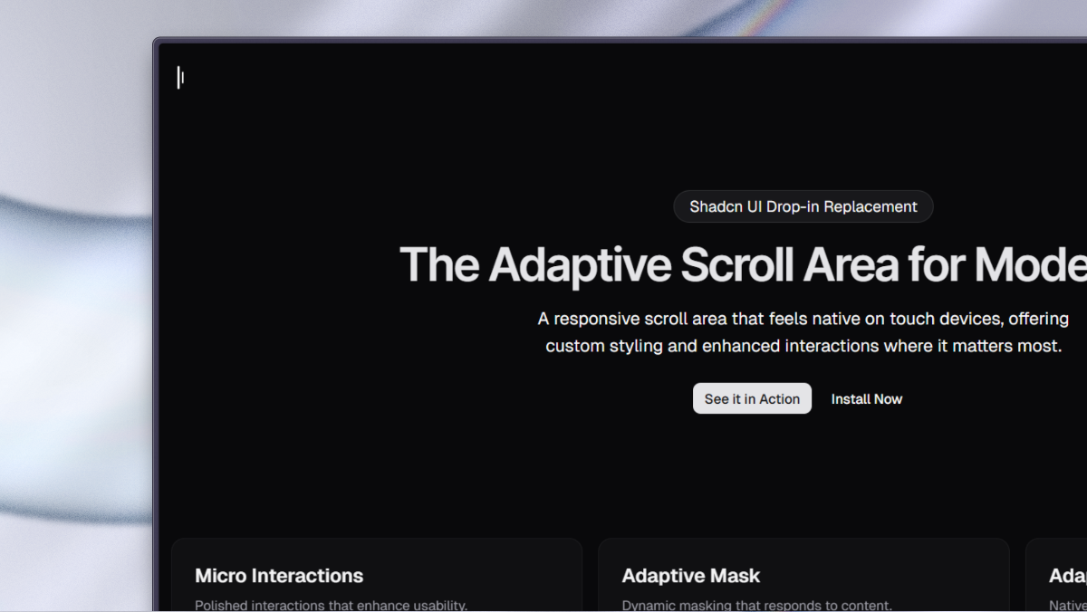
Lina
ComponentsA responsive scroll area that feels native on touch, and custom where it matters.
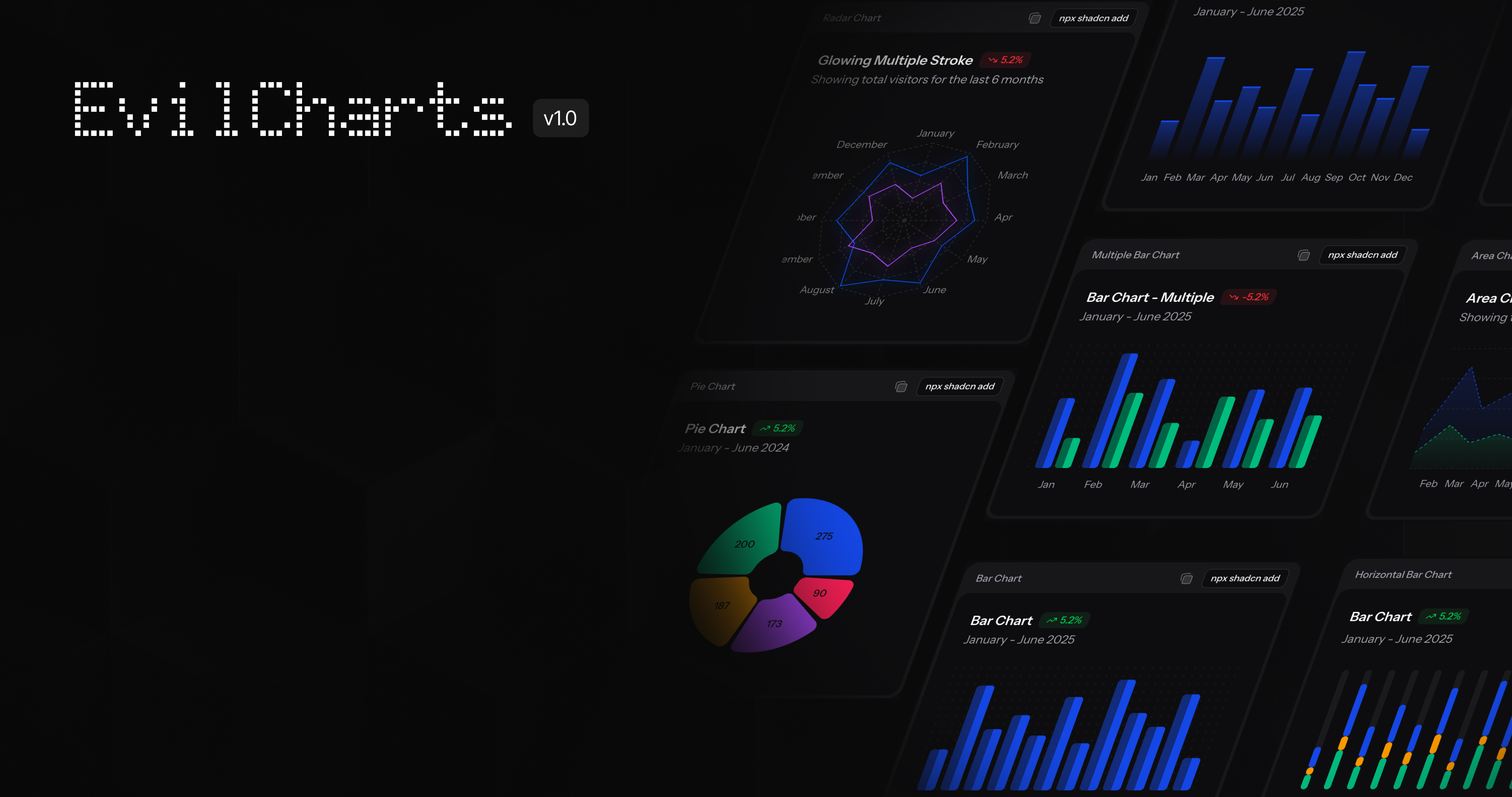
Evil Charts
componentsEvil Charts is a library of beautiful charts components that are easy to use and customize. It is built with Tailwind CSS and React. Built on top of shadcn/recharts.
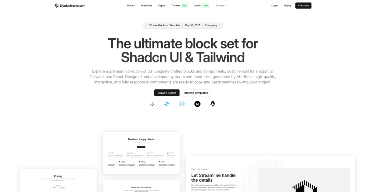
Shadcn blocks
ComponentsDiscover hundreds of extra shadcn/ui blocks and Shadcn UI components. Shadcnblocks is a premium component library built with Shadcn UI, React & Tailwind.

Eldora UI
ComponentsBeautiful UI components and templates to make your landing page look stunning.

Cosmic UI
ComponentsA curated set of futuristic UI components — reusable, customizable, and framework-friendly.
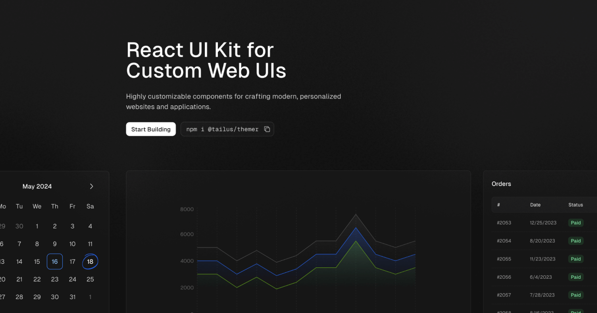
Tailus UI
ComponentsHighly customizable components for crafting modern, personalized websites and applications.
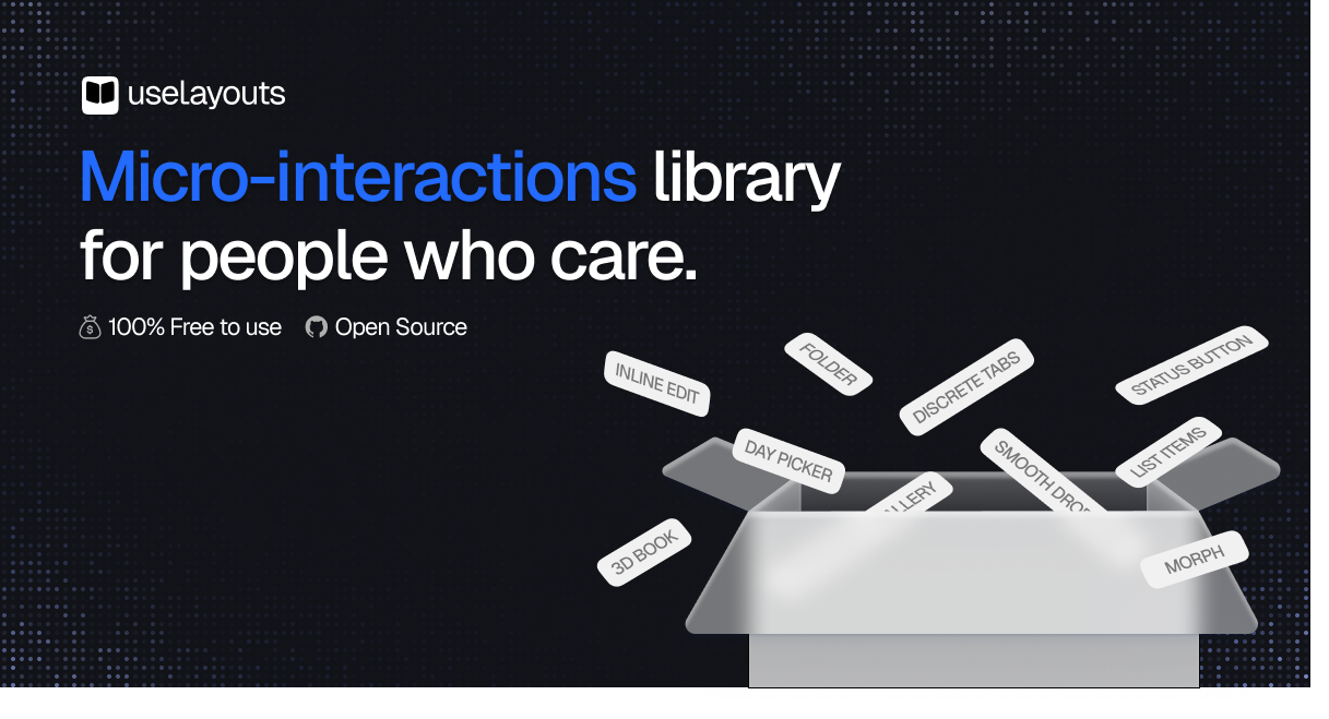
uselayouts
ComponentsFree premium animated React components and micro-interactions built with Framer Motion and Tailwind CSS. Modern, ready-to-use motion components for high-converting websites.

Chamaac UI
ComponentsExplore a premium collection of high-performance shader components, interactive backgrounds, and modern UI elements crafted with React and GLSL.

Ali Imam
ComponentsHi, I'm Ali Imam, I love design and code, I'm currently building a free, open-source design library for everyone.

Zippystarter
ComponentsBuild faster with Zippystarter. Expertly crafted and fully customizable templates, blocks and components powered by React, Tailwind and shadcn/ui.
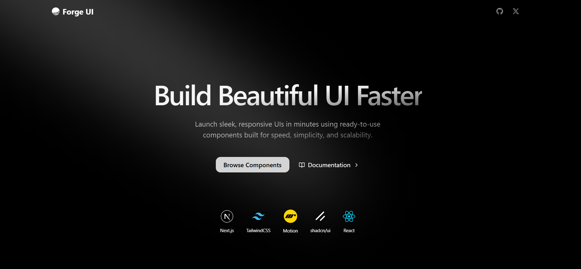
ForgeUI
ComponentsBeautifully designed components you can copy and paste into your apps. Open Source. Customizable. Accessible.
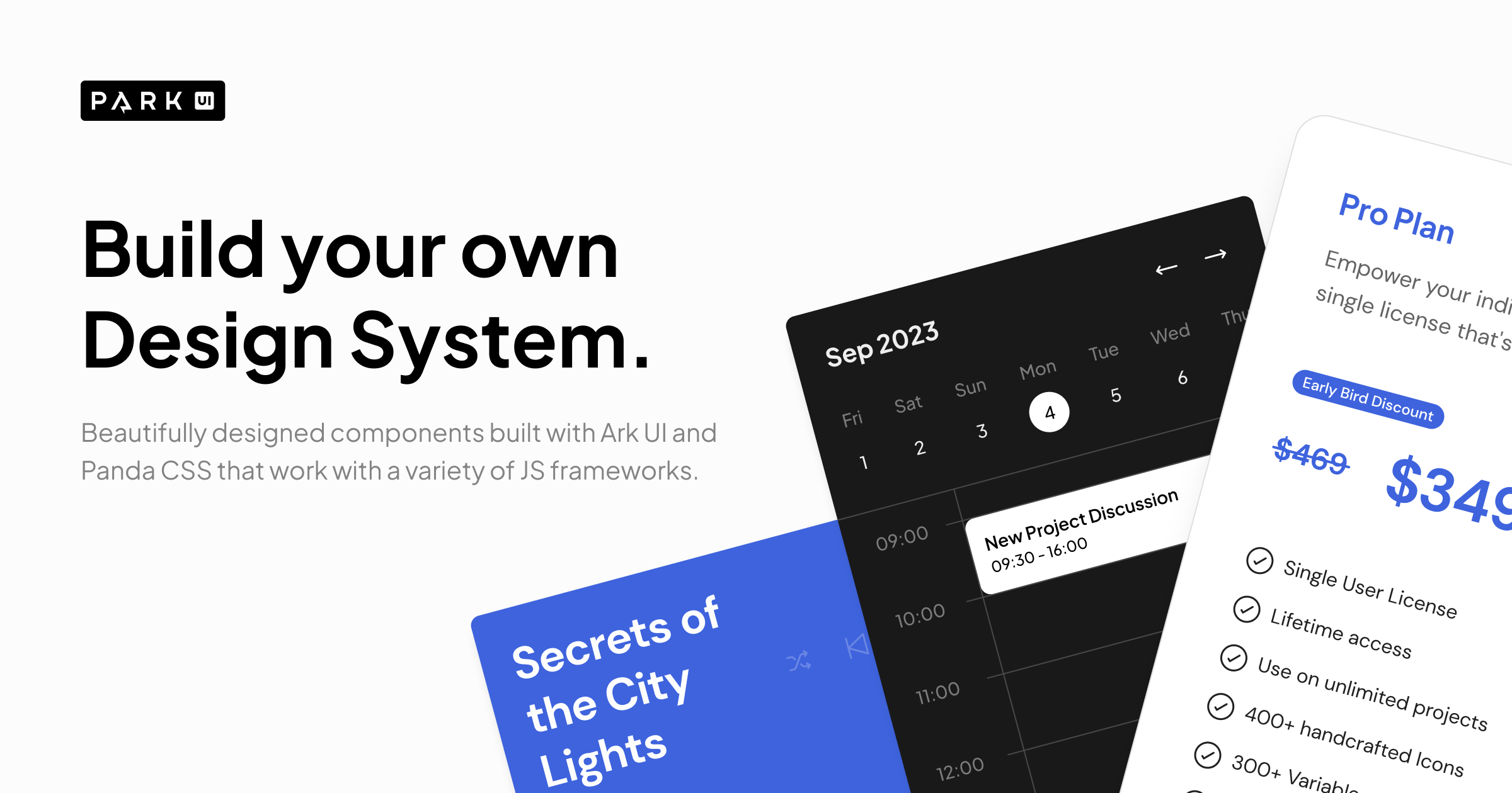
Park UI
ComponentsBeautifully designed components built with Ark UI and Panda CSS that work with a variety of JS frameworks.
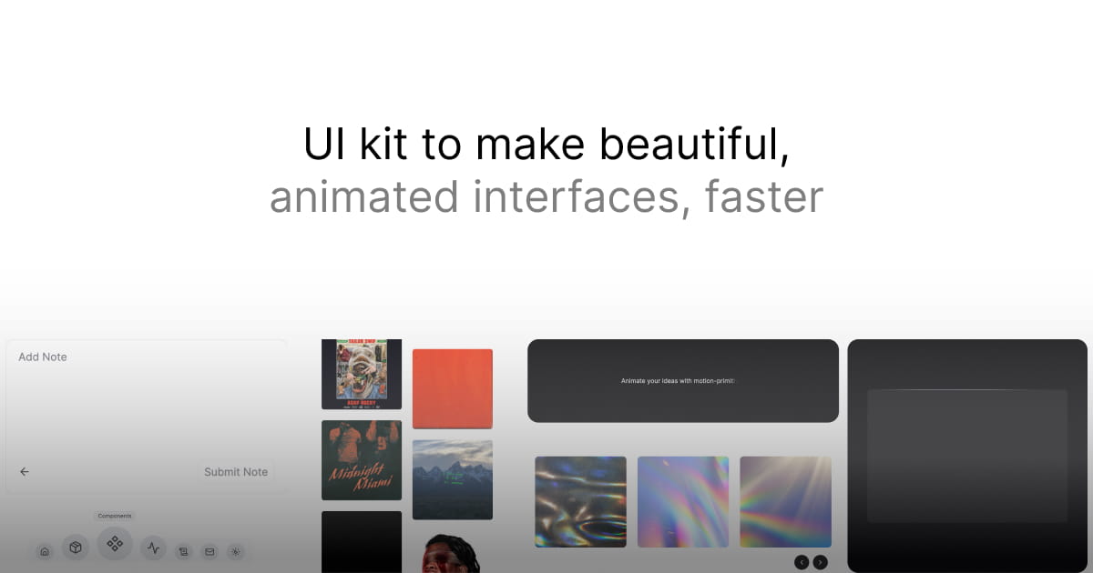
Motion Primitives
ComponentsMotion-Primitives is an open-source UI kit to make beautiful, animated interfaces, faster. Built for React, Next.js, and Tailwind CSS.

prompt-kit
ComponentsCore building blocks for AI apps. High-quality, accessible, and customizable components for AI interfaces. Built with React, shadcn/ui and Tailwind CSS.

21st.dev
ComponentsDiscover fresh UI inspiration, add favorites to your canvas, and generate hundreds of fresh variants based on your taste. No pixel-pushing required.
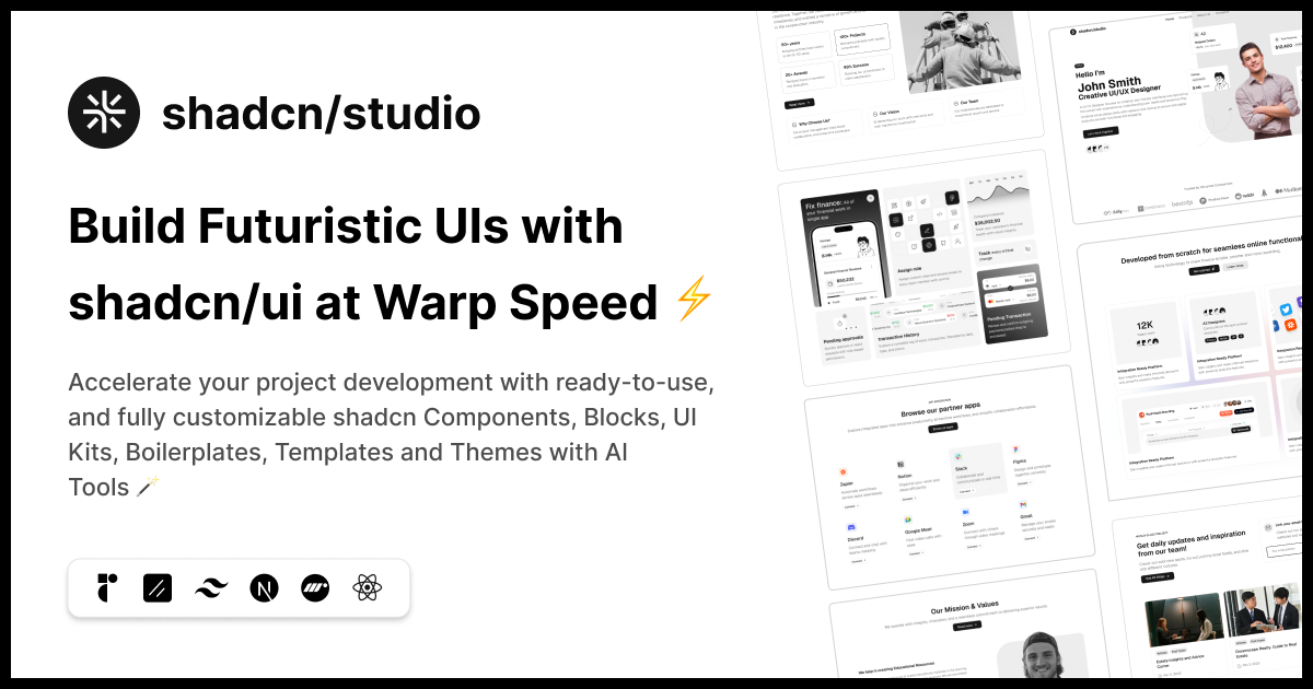
Shadcn Studio
ComponentsAccelerate your project development with ready-to-use, & customizable 1000+ Shadcn UI Components, Blocks, UI Kit, Boilerplate, Templates & Themes with AI Tools.
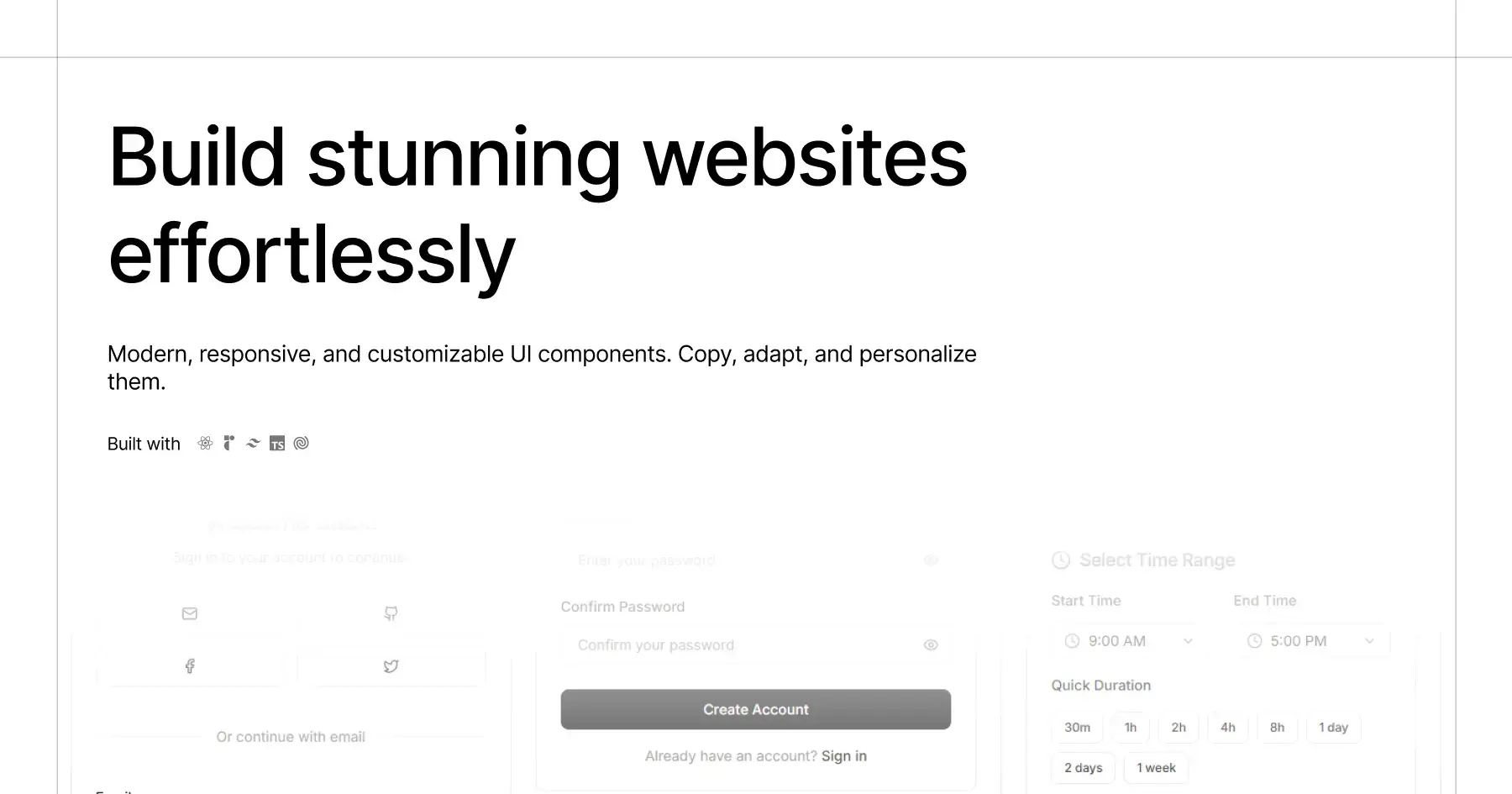
HextaUI
ComponentsModern, responsive, customizable UI components. Copy, adapt, and personalize them.
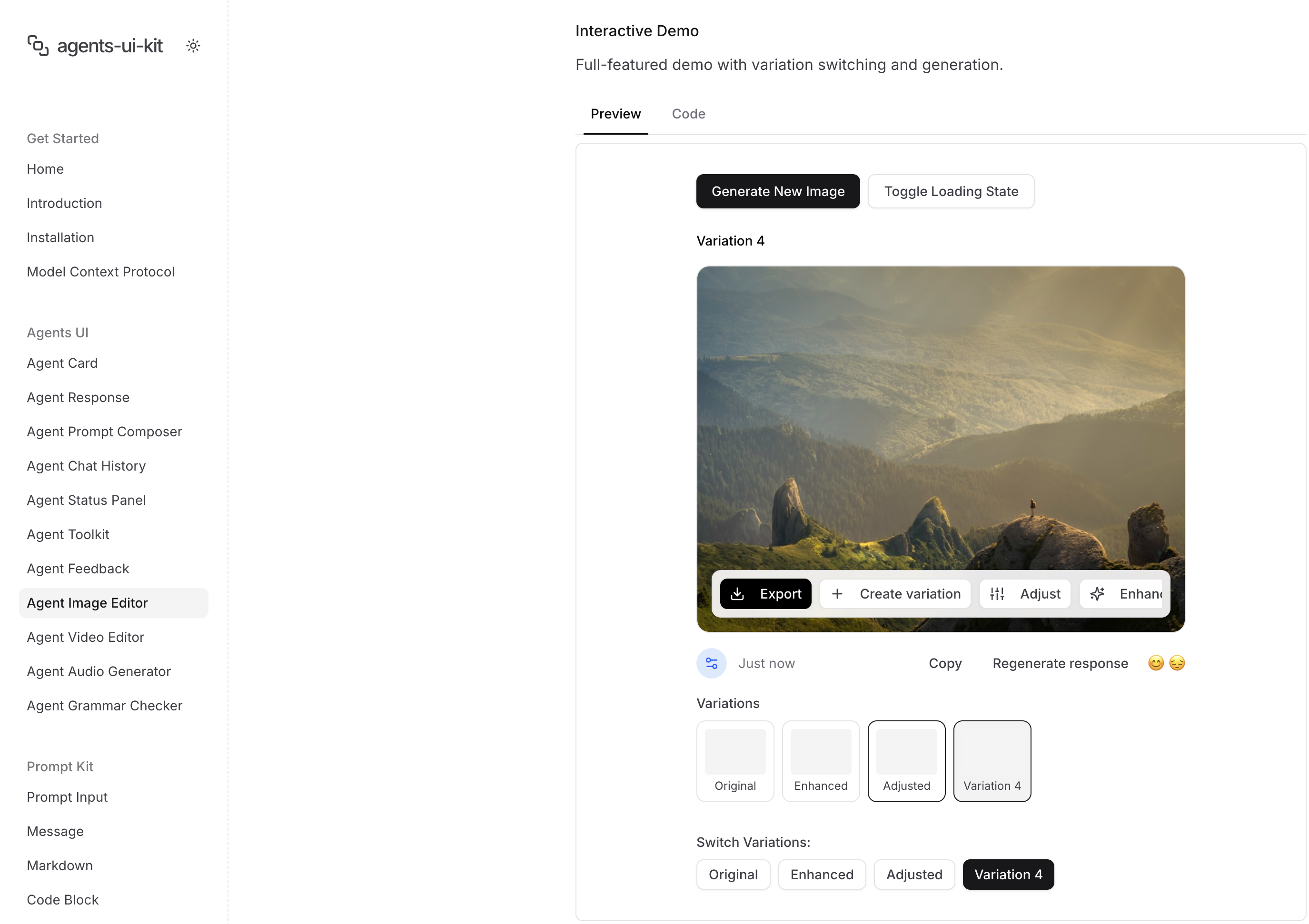
agents-ui-kit
ComponentsAdvanced UI components for building AI agent interfaces. Build sophisticated agent experiences, autonomous assistants, and multi-agent systems with beautiful, customizable components.

Intent UI
ComponentsIntent UI lets developers copy-paste fully-accessible React components, tailor them with Tailwind, and ship production UIs in minutes.

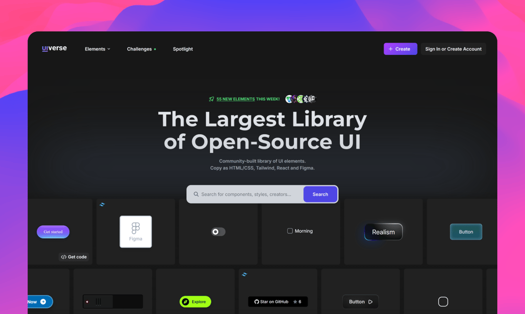
Uiverse
ComponentsCommunity-made library of free and customizable UI elements made with CSS or Tailwind. It's all free to copy and use in your projects. Uiverse can save you many hours spent on building & customizing UI components for your next project.

VengeanceUI
ComponentsBeautiful, modern, and customizable React components. Build stunning interfaces with VengeanceUI - a premium component library for React and Next.js.
TrupleD
ComponentsUI TripleD (tripled) offers production-ready UI components, motion blocks, and landing page templates powered by shadcn/ui and Framer Motion.
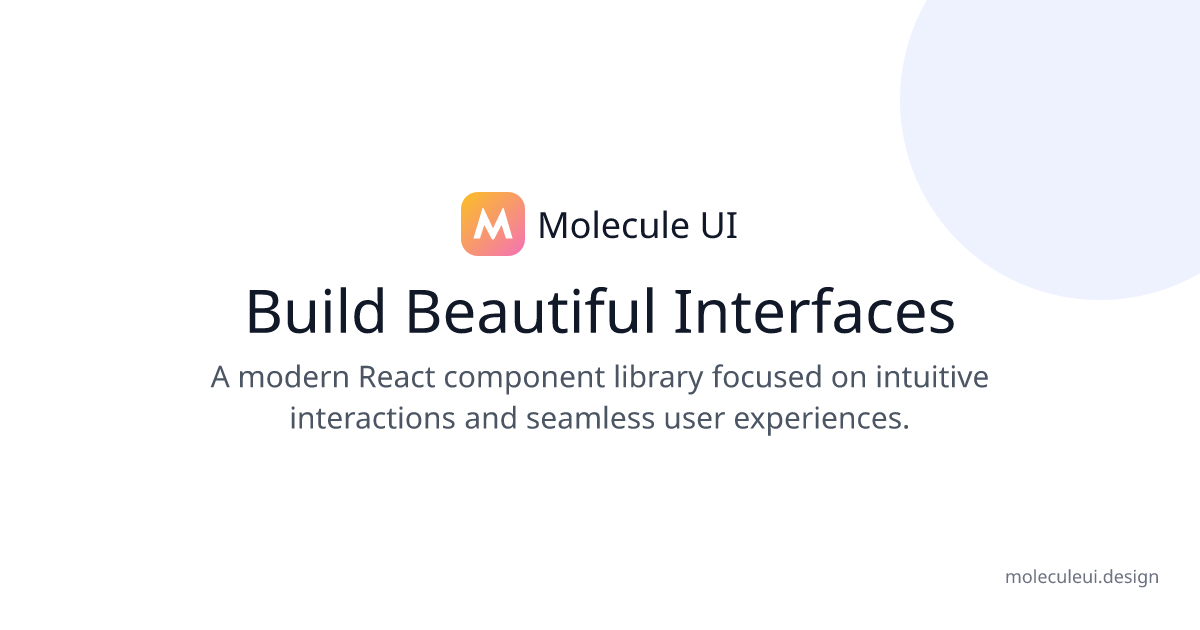
Molecule UI
ComponentsA modern React component library focused on intuitive interactions and seamless user experiences.
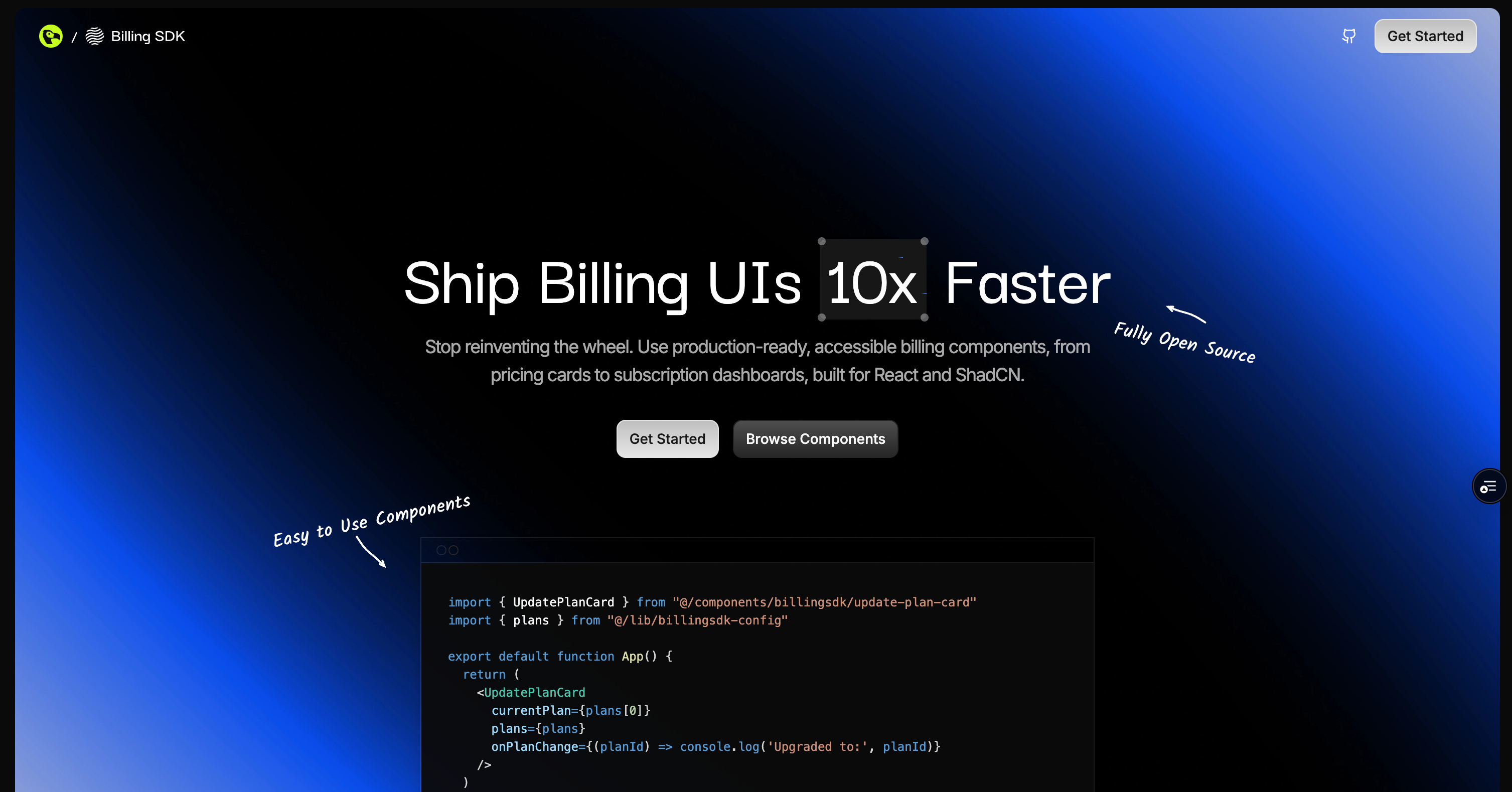
Billing SDK
ComponentsA comprehensive collection of modern billing and subscription management components built with React, TypeScript, and Tailwind CSS. Perfect companion for shadcn/ui.

Prism UI
ComponentsBuild better apps faster with Prism UI - Modern React component library with pre-built sections and advanced UI patterns

kitze Ui
ComponentsKitze UI is a collection of reusable components compatible with the shadcn CLI, designed to make building beautiful and functional interfaces easier, and with much less boilerplate.
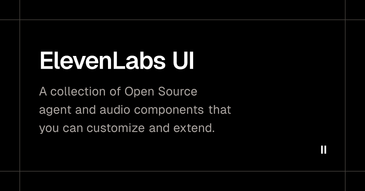
ElevenLabs UI
ComponentsA collection of Open Source agent and audio components that you can customize and extend.

Serenity UI
ComponentsCollection of customizable and open source components made with Next.js, Tailwind, Typescript, and Framer motion.
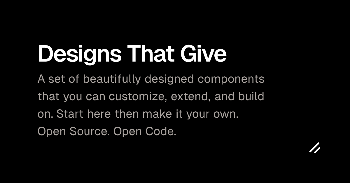
Dalim UI
ComponentsA set of beautifully designed components that you can customize, extend, and build on. Start here then make it your own. Open Source. Open Code.
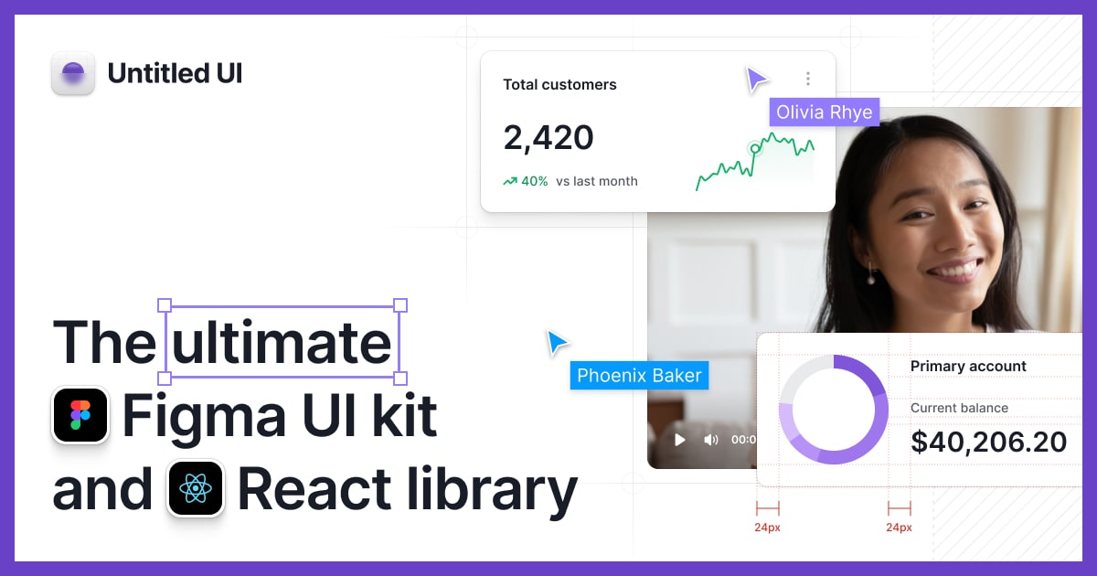
Untitled UI
ComponentsUntitled UI is the world's largest Figma UI kit and React component library. Kickstart any project with everything you need to design and develop—fast.

Retro UI
ComponentsRetroUI - Retro styled component library built with React and TailwindCSS for modern web apps.


Svelte Shadcn
ComponentsA set of beautifully-designed, accessible components and a code distribution platform. Open Source. Open Code.
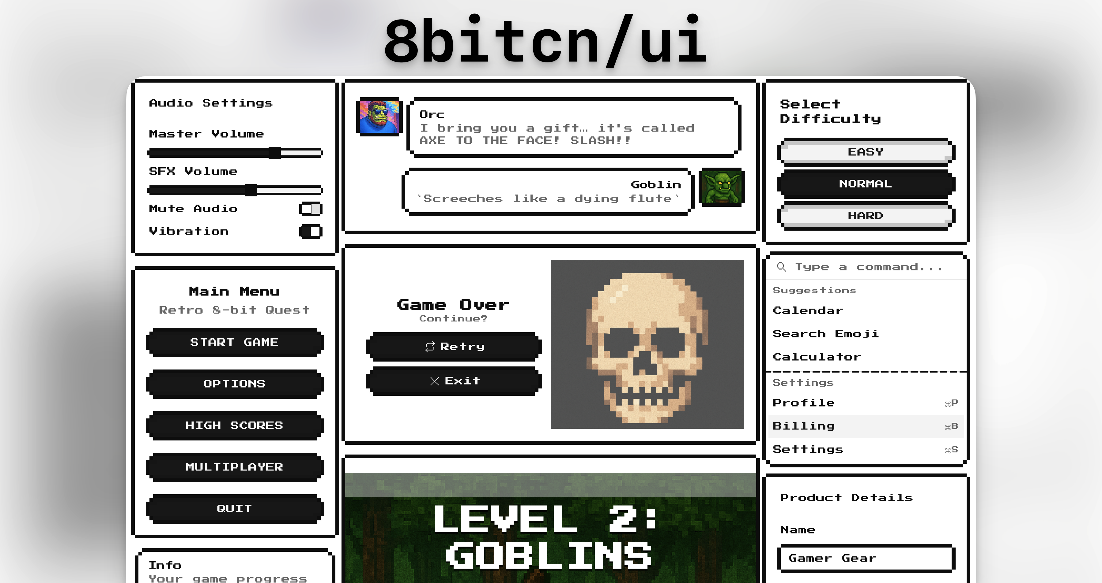
Pixelact UI
ComponentsA modern pixel art styled React component library built on shadcn/ui. Open source, customizable, and perfect for retro-themed applications.

Spectrum UI
ComponentsBeautifully designed, accessible React components built with Tailwind CSS. Copy, paste, and customize. Perfect for Next.js applications. Open source and free to use.


ScrollX UI
ComponentsScrollX UI is an open-source library with customizable, animated, interactive React components to help developers build fast, visually appealing UIs.

Systaliko UI
ComponentsCollection of fully customizable, animated, free UI components built with React, TypeScript, Tailwind CSS, and Motion.
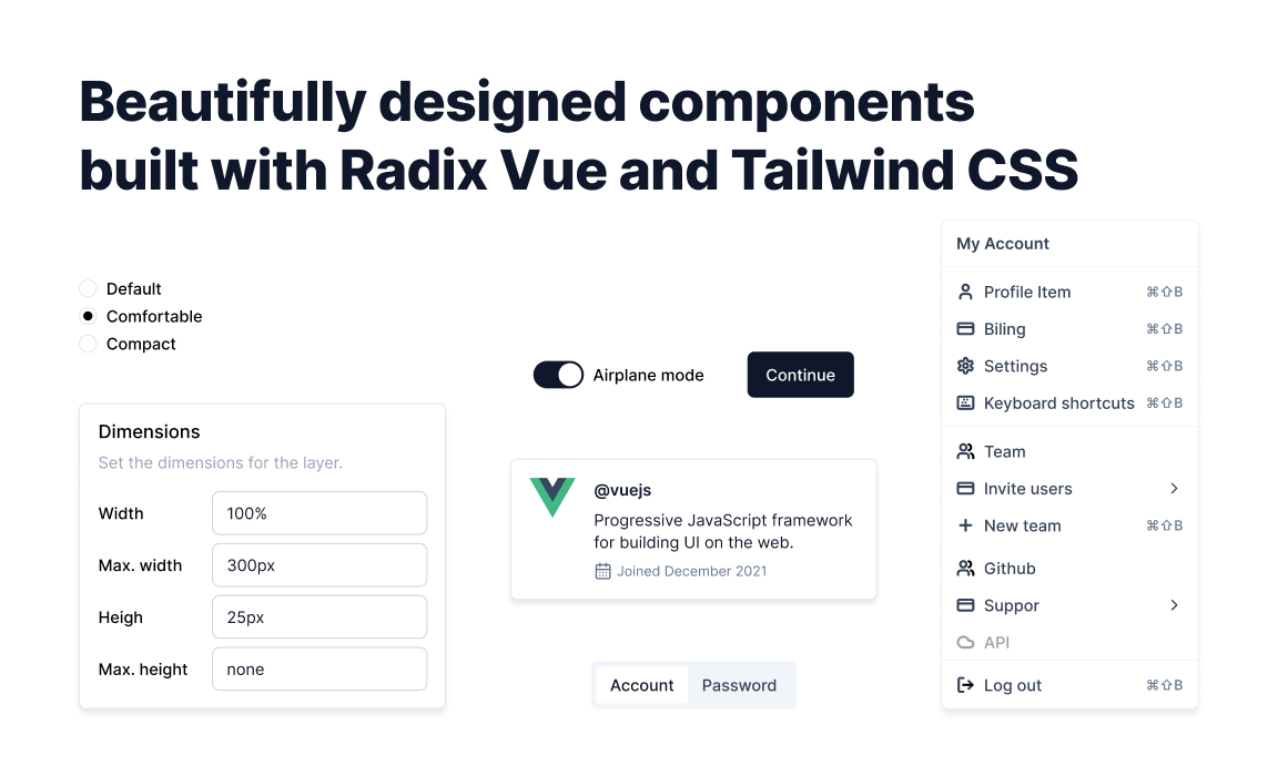
Shadcn for Vue
ComponentsBeautifully designed components built with Reka UI and Tailwind CSS.
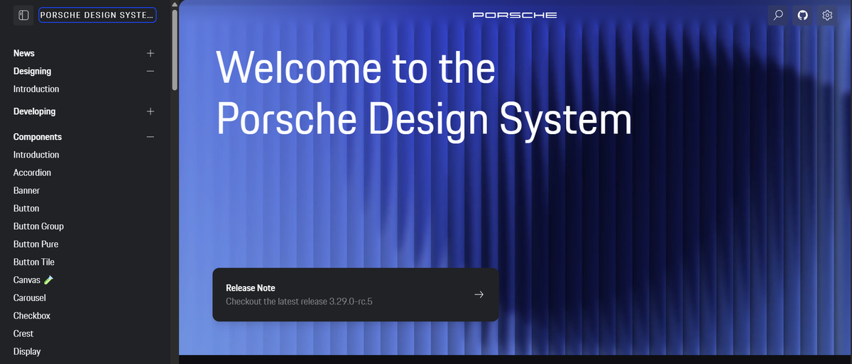
Porsche Design
ComponentsFind all the fundamental UXI guidelines and pattern-based web components to build brand driven, consistent and intuitive designs for digital Porsche products.

Craft UI
ComponentsBuilding blocks for your Next.js project. Copy-paste components built with Tailwind CSS and shadcn/ui.
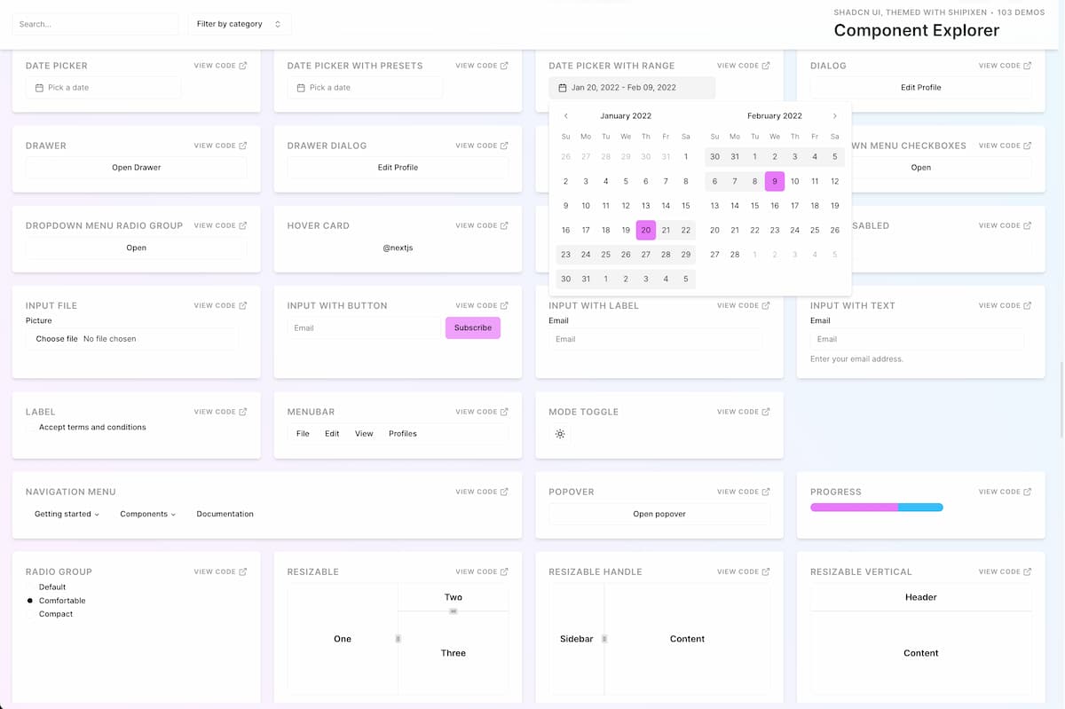
Shipixen
ComponentsView, interact and search for any component from the Shipixen & Shadcn UI library. Select themes, fonts andsSee code examples of all Shadcn UI components.

Tailframes
ComponentsExplore a visually stunning collection of web components crafted with precision using Tailwind CSS. Elevate your design with seamless integration, responsive layouts, and customizable elements.

Better Upload
ComponentsThe simple and bloat-free way to upload files in React. Upload directly to any S3-compatible service with minimal setup.
roiui
ComponentsComponents and blocks made with Base UI primitives and motion. CSS modules and Tailwind available.


WigggleUI
ComponentsA beautiful collection of 80+ copy-and-paste widgets for your next project.
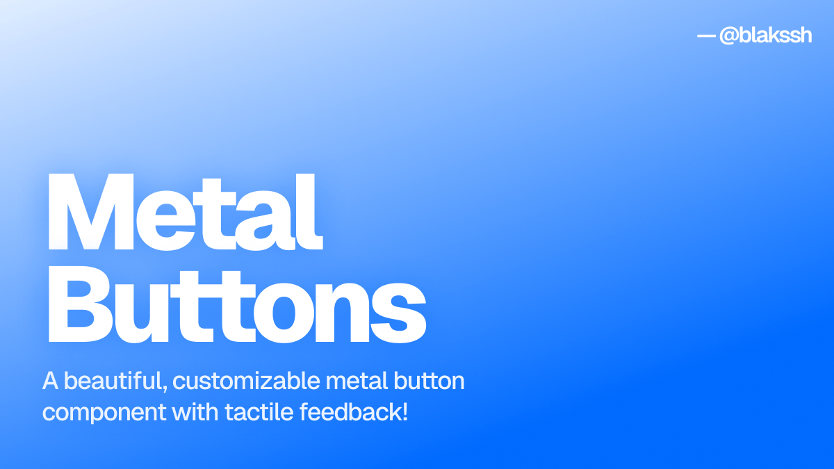
Metal Buttons
ComponentsA beautiful, customizable metal button component with tactile feedback!

CommerCN
ComponentsShadcn UI blocks for e-commerce websites. Built with React, Next.js, and Tailwind CSS.
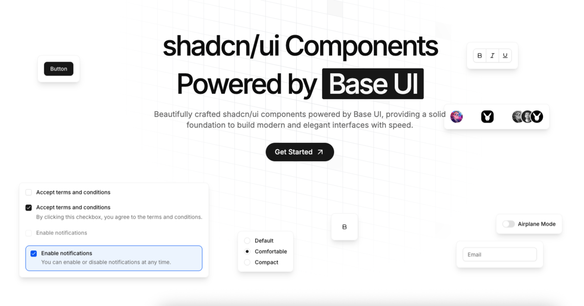
Basecn
ComponentsBeautifully crafted shadcn/ui components powered by Base UI, providing a solid foundation to build modern and elegant interfaces with speed.


dotUI
ComponentsBuild your design system in seconds, so your app look like your brand, not a preset.

GAIA UI
ComponentsBeautiful, accessible React components from the GAIA AI assistant project. Free and open source UI library for building chatbots and AI interfaces.

Aceternity UI
ComponentsCopy paste the most trending components and use them in your websites without having to worry about styling and animations.